Anúncios
You want buttons that help people, not trick them. Most visitors scan headlines and the short bits of copy. A clear action on your page earns attention and trust.
Simple language, real value, and one obvious action are the foundation. Button-based ctas have lifted clicks by about 30% over plain text links, and personalized ctas can perform far better.
This short guide gives practical examples you can drop into your website or landing page. You’ll learn how tiny tweaks to copy, color, and micro-interactions create a friendlier way to win a click.
When you’re ready to get started, use clear promises and a primary action paired with a gentle secondary option. For more live examples and data, see this helpful collection of call-to-action examples from a marketing lab: real call-to-action examples.
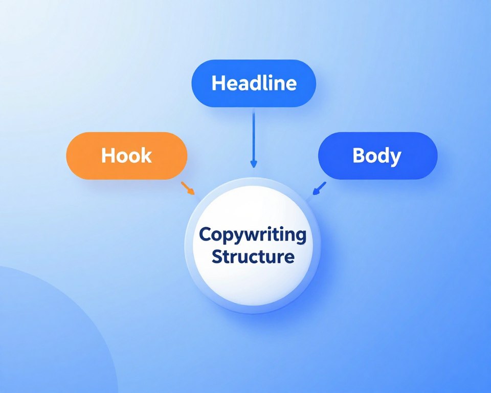
Why CTAs Win or Lose Clicks on Your Landing Page
Most people skim; your job is to make the choice obvious fast. Research shows about 90% of website visitors scan headlines, subheads, and button copy first. That means placement and clarity matter more than clever phrasing.
Anúncios
What website visitors actually scan first
Headlines and subheads grab attention. Then eyes drop to the primary button or action label.
Front-load the most important value in those spots. If your headline promises a benefit, make the button echo that outcome.
From headline to primary CTA: keeping a single focus
One obvious action reduces friction and helps users decide quickly. Use clear words, generous white space, and contrasting design so people can spot the button during a fast scroll.
Anúncios
- Place the primary cta above the fold and repeat it where interest peaks.
- Make the action explicit — short, concrete words beat “Submit.”
- A single main button keeps your audience on one path and protects trust over gimmicks like false urgency.
The CTA conversion style That Puts Value First
Say exactly what happens after the click and people will follow. Strong buttons replace vague verbs like “Submit” with outcomes such as “Get the plan” or “Give me the guide”. That clarity lowers anxiety and makes the next step obvious.
Use positive, inclusive language that invites people in. Words like “Join” or “Find your flavor” feel human and friendly. If first-person copy fits your brand, try “Give me the guide” to increase ownership of the action.
Match your brand voice. Playful brands can be cheeky; premium brands should stay polished. Be creative only when it stays clear — witty microcopy plus a short supporting line under the button helps users understand the value.
- Swap “Submit” for a specific outcome: reduces friction and sets expectations.
- Keep language inclusive and supportive: avoid pressure, urgency, or scarcity tricks.
- Test on your audience: small copy changes often yield meaningful lifts.
Match CTA Temperature to Traffic Intent
Not every visitor is ready to buy — your action should meet them where they are. Use the Ice Cube & Volcano scale to grade traffic from cold to hot.
Cold, warm, hot: the Ice Cube & Volcano scale
Cold users need low-commitment asks. Use gentle language like “Learn more” to educate without pressure.
Warm audiences respond well to trial-style offers. Phrases such as “Start free trial” or “Start free” build momentum without forcing a purchase.
Hot customers are ready for action. Clear buttons like “Buy now” or “Get started” match urgency and intent.
Ad channel nuance: search, social media, display
Display often sends colder traffic; lead with education. Search can be warmer depending on query — test stronger asks there. Social media varies by creative and targeting.
Practical examples and quick rules
“See what your case is worth” — a lawyer-friendly example that clarifies the value behind a consultation.
- Match the action to the problem and outcome the audience cares about.
- Offer step-down actions for colder sessions so people self-select intensity.
- In ads, state what happens after the click — e.g., “Watch a 3‑minute demo.”
Test buttons by channel and measure results across funnel stages. When your language matches intent, people find the next step makes more sense and engagement improves.
Lead Generation CTA Styles That Grow Your List
Lead magnets that promise a clear payoff help you turn casual visitors into subscribers fast.
Use specific offers so your audience knows exactly what they get after the click.
Download, save your spot, personalized quote
Try labels like “Get your free toolkit”, “Save your spot”, or “Get a personalized quote”. These examples show the value and invite users with a low-friction action.
Personalized prompts can perform up to 202% better because they feel relevant to customers.
Micro-commitments that reduce friction
Start small. Ask for one field on a landing page, then use a second step for details. Multi-step forms lower cognitive load and keep more people moving.
- Offer a named download like “Download the 2025 report” to increase perceived value.
- Restate privacy and email expectations near the button to remove doubt.
- Test button copy that focuses on outcome (“Get the pricing breakdown”) versus format (“Download PDF”).
Follow up fast with the promised item; fulfillment speed builds trust and opens the next step.
Click-Through CTA Styles That Guide Exploration
Guide curious visitors with gentle actions that invite them to learn more without pressure. Use short, descriptive labels like “See how it works” or “Discover what’s new” to move your audience deeper into content and product areas.
In email and ads, place the primary button near the top and repeat it after key benefits so scanners can click quickly. For paid ads, promise the next step plainly — “Watch a 2‑minute tour” sets clear expectations and lowers friction.
- Use exploratory actions — “Take a closer look” or “See it in action” — to guide users without forcing commitment.
- Keep the page layout clean so the path from headline to button and onward is obvious.
- Test micro-interactions that acknowledge hover or tap; small motion increases perceived responsiveness.
Write short contextual copy around the button to explain what they’ll learn or compare next. Track which click-through labels drive the best downstream results, not just the first click, and iterate based on real examples from your marketing and landing pages.
Sales and Signup CTA Styles for Decision-Ready Users
For users primed to act, clear labels and fast fulfillment turn interest into orders. Use direct words like Get started, Start free, Create account, or Buy now so the action is obvious.
Cut hesitation by clarifying what happens after the click. Add short notes such as No credit card required, Instant access, or Cancel anytime to lower risk and help users decide.
- State trial length and access scope for a start free trial offer.
- For ecommerce, note returns, delivery time, or order status to reduce last-minute doubt.
- Keep the same button copy across steps—don’t switch labels mid-flow.
Limit competing elements near the primary button so the action dominates the page. Restate the main benefit beside the button to give users momentum and a clear sense of value.
Strong decision buttons are short, honest, and backed by fast fulfillment — that combination builds trust and closes sales.
Click-to-Call CTA Styles That Convert on Mobile
On mobile, the fastest path to help is a single tap that connects someone to a human. Use clear labels like “Call us now,” “Speak with an advisor,” or “Get immediate help.”
Place a sticky button in the header or footer so the action stays within thumb reach. Show availability — for example Mon–Fri, 9–6 — and give an expected wait time.
For service companies, add trust badges or a short testimonial near the button to lower hesitation. Make the phone number visible for people who prefer to dial manually.
- Offer after-hours alternatives like “Book a call” or “Get a callback”.
- Tell users what happens on the call — a friendly 5–10 minute consult, pricing, or next steps.
- Track calls and outcomes so you know which labels and placements drive real results.
“Talk to sales” or “Speak with an advisor” removes friction by matching the audience’s intent.
Social Engagement CTA Styles to Build Community
A well-timed social prompt can extend your reach without distracting from the page’s main goal. Social CTAs like “Follow us for daily tips,” “Share your story,” “Join the conversation,” and “Subscribe to our channel” grow reach and relationships in a friendly way.

Invite lightweight actions that feel low effort. Use short, clear labels — Follow, Share, Comment, Subscribe — so people know exactly what to do.
Follow, share, comment, subscribe
Keep these ctas secondary to your main offer. Place smaller buttons after the primary content or in a footer so they don’t compete with your main action.
Driving reach without derailing primary goals
In ads and posts, clarify the next step — “Save this post” or “Watch a quick tip” — so engagement matches intent. Occasionally offer a get free resource tied to a follow when it fits your audience.
- Use friendly prompts like “Join the conversation” to nudge people without pressure.
- Rotate social asks to keep your feed fresh and aligned to brand voice.
- Measure downstream value of social engagement, not just likes, to see how community helps long-term goals.
Secondary CTAs: When and How to Offer a Softer Step
A clear secondary option helps people who aren’t ready to commit without stealing focus from the main action. Add a softer choice next to a demanding ask so hesitant visitors can still move forward.
“Buy now” paired with “Learn more” or “Download a free guide”
Pairing a strong buy button with a lighter alternative catches different readiness levels. Use “Learn more” or “Download a free guide” to signal a low-risk next step.
Keep the secondary label on the same journey. If your primary promises instant access, the softer option should promise related info or a sample. That preserves trust and keeps people on your page.
Visual hierarchy: keep the primary cta unmistakable
- Make the primary cta bolder in color, larger in size, and higher in placement than the secondary.
- Use outline or muted fills for secondary buttons so the main action dominates.
- Place the softer option near pricing, FAQs, or under benefits where it reduces bounce without competing above the fold.
- Test whether the secondary increases total results; remove it if it distracts from your main path.
For more real-life examples, see this collection of call-to-action examples to inspire your design and copy choices.
Form Breadcrumbing: Turn Big Asks into Easy Yeses
Make the first clicks effortless so users choose to keep moving through the form. Multi-step or “breadcrumb” flows break a long ask into tiny wins.
Start with simple, non-threatening questions and build trust before requesting contact details. Use visible progress so your audience knows how many steps remain.
Reduce cognitive load with multi-step forms
Split long forms into small steps that feel effortless. Ask easy questions first and use conditional steps to shorten the path when answers allow it.
Align button copy to each step’s “threat level”
Match the label to the moment. Use gentle labels like “Next question”, then move to “See my options”, and finish with “Get my results”. Add brief reassurance near sensitive fields about privacy or follow-up.
- Keep progress visible with step indicators.
- Place value statements before big asks to remind users what they gain.
- Track drop-off by step to tune copy, order, or required fields.
Design That Demands the Click: Contrast, Size, and Motion
Visual contrast, size, and tiny animations guide the eye to the right action. Use complementary colors—like a blue background with an orange button—to make your main action pop on the page.
Keep accessibility top of mind: choose color pairs that meet contrast ratios so everyone can read and tap the button. Make buttons large enough for easy tapping on mobile and quick scanning on desktop.
Complementary colors and accessible contrast
Contrast wins attention. Complementary pairs create instant visibility and a clear path for your audience. Maintain consistent placement and padding so the action feels familiar across your website and landing page.
Micro-interactions that reward hovering and tapping
Add subtle motion — hover glows, small arrow shifts, or a quick scale — to acknowledge intent. Procurify’s button that lights up on hover is a simple example that increases perceived responsiveness without distracting users.
- Choose contrasting colors (complementary pairs) for instant visibility.
- Size and spacing matter for easy tapping and fast scanning.
- Use short, meaningful micro-interactions and keep animations brief.
- Limit nearby elements; whitespace focuses attention on ctas and buttons.
Copy that Moves People: Action Verbs and First-Person POV
Words shape expectations; the right verb moves people from curious to committed.
Use verbs that match the moment. Pick Get when someone expects an immediate benefit, Start for onboarding, Join for communities, Create for account or product setup, and Discover for exploration.
First-person button copy can increase empathy. Lines like “Give me the guide” or “Show me my options” make the action feel personal and owned by the user.
Keep urgency honest and light. Real time limits work; manufactured FOMO harms trust. Clear, specific labels outperform vague language every time.
- Match verb to outcome so the user makes sense of the next step.
- Use sentence case for readability unless your brand dictates otherwise.
- Add a short line under the button to reinforce the immediate payoff.
- For freemium flows try Start free or Get free guide.
“First-person phrasing increases ownership and often lifts clicks.” — practical example from marketing tests
Testing Your CTAs: Baselines, A/Bs, and Smart Optimization
Start by measuring where you stand so tests target real improvement, not guesswork. Capture a clear baseline in GA4 (Leads > landing page) using the last 90 days. That gives you the conversion rate to beat and a timeframe to compare.
Set your conversion rate baseline in GA4
Open GA4 and go to Leads > landing page for the last 90 days. Record the conversion rate as your control.
Use the same date range for future tests so results stay comparable.
A/B testing small changes for big lifts
Test one variable at a time — verb, length, benefit, or button color — to know what caused any gain.
Small copy shifts can pay off: a three-word example once produced a 104% lift in one test.
Personalization and adaptive delivery
Personalized CTAs can perform much better — some tests show a 202% boost. Smart-traffic tools that adapt variants to audience segments often add ~30% improvement.
- Track full-funnel impact, not just clicks or initial wins.
- Keep consistent time windows and traffic splits for clean reads.
- Retire losers quickly and document what worked to scale across pages.
Real-World CTA Button Inspiration You Can Borrow
Seeing live examples helps you pick patterns that match your audience and goals. Below are practical ways brands structure actions so the button feels like the natural next step.
Landing page examples across brands and products
Wise uses multiple hot actions in the hero — “Open an account,” “Register,” “Send money” — because many visitors arrive with high intent.
Procurify adds a hover-lit arrow that rewards interaction and signals responsiveness in the design.
- Indochino: one clear action, “Book an appointment,” framed by aspirational visuals that sell the experience.
- Waldo: a playful line plus “Start your free trial” that balances brand voice and clarity.
- Borrow structure, not copy: how the page supports the button often drives results more than exact words.
Rule-benders that still respect user trust
Secondary actions can bend rules when they add genuine value without derailing the main goal.
- Offer get free resources only when they support the core decision.
- Echo the headline promise in your button so people see one logical path forward.
- Map each example to the audience intent so your team understands the “why.”
“Use examples to learn the way a button supports the page, not just its phrasing.”
Channel Playbook: Website, Email, and Ads
Match each channel to the right action so users move forward naturally. Your website, email, and ads should feel like one path, not three separate pitches.
Website and landing flow: Repeat the same main action after key sections so the next step is always nearby. Keep the primary button copy identical on the hero, mid-page, and near pricing to reduce hesitation.
Email buttons vs text links: Buttons usually outperform inline links. Place a clear button near the headline and repeat it after a scannable benefit list. Align your subject line and preview text with that button copy to prevent a promise mismatch.
Ads that state the next step: In ads, tell people what happens after the click — “Watch a 2‑minute demo” or “Compare plans.” Tailor labels like get started or start free by channel intent. Search can bear stronger asks; social media often needs softer, helpful offers.
- Use consistent ctas and button visuals across channels to build recognition.
- Route smartly: personalize the action by channel performance.
- Track clicks back to outcomes so your marketing tests improve real results.
Conclusion
Finish by making the main action unmistakable and the outcome obvious so people act with confidence. Place a clear cta and a single primary button that signals what happens next.
Focus your copy on specific value and use respectful language that helps users decide. Match the action to the audience’s intent and give colder visitors a softer option without stealing focus.
Keep design accessible: strong contrast, simple motion, and roomy placement for your buttons. Reduce friction with breadcrumbed forms and short microcopy that explains the next step.
Test, baseline, and personalize over time. Small, honest changes add up, and this way your ctas and actions become reliable revenue drivers without tricks.