Anúncios
Turning casual visitors into users starts with a clear, focused page. A sign up page is a dedicated landing page that guides people to register, subscribe, or buy without relying on price cuts. The right mix of images, copy, and a simple form removes friction and builds trust.
Understand which parts matter most. Good landing pages place benefits and proof near strong call-to-action buttons. Design and concise content make it easy for visitors to find the information they need and take action.
We focus on the registration process, forms that convert, and layout choices that boost conversion rates. You will see practical page examples and tactics that help a product or company stand out.
By following these guidelines, your website can drive consistent user action and raise subscription and registration rates—without coupons or discounts.
Anúncios
Understanding the Role of Signup Landing Elements
Visitors convert when a page removes doubt and shows exact benefits of signing up. A focused landing page acts like a one-person sales team: it greets the user, explains the offer, and points to a clear action.
“Don’t make me think.”
Keep the path short. Remove extra navigation, limit choices, and place the value proposition next to the form. This reduces friction and shortens the time to registration.
Use concise copy and professional images to build trust. Pair that with visible proof and clear buttons to boost conversion rates.
- Explain what the user gets for their email in one sentence.
- Simplify the form so visitors finish the process fast.
- Remove site clutter so the page stays focused on registration.
Result: A clean, intuitive page increases form completions and drives more active users to your product or subscription.
Why Dedicated Pages Outperform Homepages
A focused page works like a narrow funnel: it channels attention toward one clear action. Treating a page as a standalone product helps visitors decide faster. Research by Omnisend shows that dedicated landing pages yield the highest conversion rate at 23% for sign forms.
The Importance of Focus
When copy, images, and the form all point to one goal, the user sees value quickly. A tight design reduces noise and clarifies benefits.
Removing Navigation Distractions
Take away top bars and side links so visitors stay on the path. This prevents wandering and shortens the time to registration.
- One goal: make the desired action obvious.
- One form: ask only for the essential email or info.
- One visual: use images and buttons that support the message.
“Clarity beats persuasion when attention is limited.”
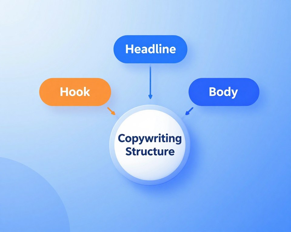
Anatomy of a High-Converting Signup Page
A high-converting page wires attention to one clear promise and makes the value obvious in seconds. A concise headline should tell the target audience what they get and why it matters.
The design must make the form stand out on the page so visitors find it instantly. Use whitespace, contrast, and a simple layout that points toward the action.
Keep the registration form short. Fewer fields mean less friction and a higher rate of completion. Ask only for what you truly need to start the process.
Benefit-focused copy explains what the user gains when they provide an email to your company. Include key information that answers common doubts to remove hesitation.
“Clarity speeds decisions.”
- Headline that states value quickly.
- Visible form and contrasting call-to-action buttons.
- Short copy and essential info to build trust fast.
Test variations of your pages to learn which design and copy combinations raise conversion. A professional page layout is the most important way to turn website traffic into loyal users.
Crafting Compelling Headlines That Grab Attention
A headline must hook the reader in the first two seconds and promise a clear outcome.
Good headlines state the benefit quickly and make the page feel worth a moment of attention.
Writing Benefit-Oriented Copy
Use a single, bold sentence to explain what a user gains. FedEx’s line,
“When it absolutely, positively has to get there overnight.”
is a clear model: one promise, one result.
Focus on results rather than feature lists. Tell visitors what changes for them and why registration or a short form is the logical next step.
Test multiple headlines and track which version raises conversion. Align the headline with the ad or link that brought a user to the page to keep the message consistent.
- State the value in plain language.
- Address one pain point and offer an outcome.
- Match headline tone to the rest of the content.
For more tips on crafting headlines that convert, see this short guide.
Leveraging Visuals to Drive User Growth
Visuals do the heavy lifting: they show value, reduce doubt, and push visitors toward the form.
Incorporating visually appealing images or a short video on your landing page can boost conversion dramatically. High-quality hero shots that feature your product or team work better than generic stock photos. They help visitors place themselves and understand the benefits fast.
Use white space and a clear design so graphics do not clutter the page. The best landing pages guide the eye to the form and the call to action.
Test visuals to learn what converts for your product. Try a product demo video, a customer photo, or a hero shot and measure which one raises registrations or email captures.
- Use a hero shot that shows the product or team.
- Guide the eye from imagery to form with contrast and spacing.
- Measure results—different pages and visuals yield different conversion rates.
“Good visuals answer questions before a visitor has to ask.”
The Power of Social Proof in Building Trust
Trust grows quickly when visitors see evidence that others already use and value a product. On a landing page, proof reduces doubt and nudges people to take action.
Use real voices. Short testimonials with a photo and job title make copy feel credible. Ruby, for example, pairs a striking hero image with customer quotes to show service value.
Using Testimonials Effectively
Keep quotes specific and outcome-focused. One or two lines about time saved or better customer experience is enough.
Include a name, role, and, when possible, a photo. This small detail lowers perceived risk in the registration process.
Displaying Client Logos
Logos and trust badges act as instant proof. GraphicsZoo uses a simple page to showcase agency partners and build confidence.
- Show numbers: subscribers or positive reviews create a sense of FOMO.
- Use real photos: happy customers beat generic stock images.
- Include a badge: BBB or well-known clients adds authority.
“People trust people—let your customers do the talking.”
Every page should feature at least one form of proof so visitors feel in good company. Social proof validates your copy and improves conversion by making the decision feel safer.
Designing Frictionless Forms for Better Conversion Rates
Make your form the path of least resistance so visitors give an email and move on fast. A short, clear form lowers friction and helps your page turn casual readers into users.
Ask only for essentials. Request an email or one key field. Every extra box adds hesitation and can hurt your conversion rate.
Place the form in a distinct box with a contrasting background so it stands out on the page. That visual cue draws the eye and speeds the action.
Offer value up front. Give an eBook, quick guide, or access to a product preview in exchange for contact details. Clear benefits make visitors more willing to register.
Include helpful, immediate error messages so users can fix mistakes without frustration. Make buttons easy to tap on mobile and test different form lengths to find the best balance.
- Keep fields minimal to boost completion.
- Use builders and tools to create forms fast without code.
- Make mobile touch targets large and obvious.
“A simple form is the most effective way to ensure visitors complete the registration process.”
Strategic Use of Call to Action Buttons
Buttons do more than look clickable; they shape the user’s next decision on the page. A call to action must stand out so visitors can find the final step in the registration process without hunting for it.
Create visual contrast. Use a color that opposes the background so the button pops. Contrast directs the eye to the form and raises the conversion rate.
Write action-oriented copy that explains the benefit. Phrases like “Get Your Free Guide” or “Start Your Trial” tell visitors what they will receive and reduce friction.
Practical Rules for Better Conversion
- Place an obvious CTA near the form and repeat it at key points on long pages.
- Limit the number of buttons to avoid confusion—one clear path converts best.
- Test button colors and text with simple A/B trials to improve click rate.
Remember: a high-converting page uses buttons that feel natural and exciting. Make the button easy to spot, describe the benefit, and keep the path to conversion simple.
Applying Psychological Triggers Without Discounts
You can nudge visitors toward action by applying subtle behavioral triggers. PointsBet shows how an irresistible offer on a landing page converts prospects without long-form persuasion. Veteran copywriter Roy Furr calls an irresistible offer one that makes value obvious and immediate.
Focus the page on benefits, not price. Highlight what a visitor gains and reward attention with early access or exclusive info. That approach builds trust and makes the registration process feel worthwhile.
Use urgency or exclusivity to push action. Limit spots, add a time cue, or promise early content to encourage visitors to fill the form now. Back those claims with clear proof to lower doubt.
Test different triggers to learn what raises conversion rate. A strong landing page pairs simple copy, concise forms, and visible proof so your company converts more visitors and builds longer-term relationships.
- Offer immediate value to reward a quick email or sign.
- Create limited access to boost urgency and trust.
- Measure which cues increase the registration rate.
Optimizing for Mobile and User Experience
Mobile users expect a fast, clear page that feels built for their screen. Make sure your design prioritizes readability and quick access to the form and benefits.
Keep text legible and buttons large enough to tap with one thumb. If copy is tiny or the form fields are cramped, visitors will abandon the process.
Compress images, trim unused scripts, and prefer native controls for inputs to speed load time. A fast, visually appealing page preserves trust and improves conversion rate.
- Test on devices: check phones and tablets to ensure consistent layout.
- Use tools: device emulators and real-device tests reveal issues early.
- Build mobile-first: start with small screens so the website scales up cleanly.
For practical optimization ideas and tools, see mobile landing page optimization. A refined mobile experience helps visitors complete registration or submit an email with less friction.
Testing and Refining Your Page Design
Testing your page design uncovers how real visitors react to your form and copy. Start with a simple hypothesis: one change, one metric. That keeps experiments clean and actionable.
The Role of A/B Testing
Use A/B tests to compare two page examples. Beehiiv and similar tools make it easy to run experiments and track conversion rate. Test headlines, buttons, or a single image to find what nudges people to sign.
Analyzing User Behavior
Watch where visitors pause or drop off. Heatmaps and session recordings reveal friction in the registration process. Combine those insights with metrics to spot repeatable problems.
Iterative Improvements
Treat every page as a work in progress. Make small changes, measure impact, and repeat. Over time, this way of working builds proof that your company’s design choices actually improve the rate of conversions.
- Run focused tests with clear goals.
- Use tools to collect real user data.
- Ship small updates and measure results.
Common Mistakes That Kill Conversion Rates
A cluttered page makes it hard for visitors to see the benefits and complete the registration process. Small issues add up and lower your conversion rate quickly.
Too much text overwhelms users. Break copy into short lines, highlight the value, and remove anything that does not support the page goal.
Unclear CTAs or missing buttons leave people unsure how to sign. Put one obvious action near the form and repeat it where needed.
Neglecting load time hurts a slow website. Compress images, trim scripts, and test on mobile so the form shows fast and reliably.
Generic stock photos reduce trust and weaken proof. Use real photos or client logos so your company looks credible at first glance.
“Every element must earn its place. Remove anything that distracts from the one way to convert.”
- Keep forms focused—ask only for essentials.
- Audit your page regularly with simple tools and user tests.
- Prioritize clear design, fast load, and visible proof to lift your conversion rates.
Conclusion
A clear end goal and thoughtful design turn casual visits into measurable action. Focus copy on benefits, keep forms tiny, and make the call to action obvious.
Remove distractions and add social proof to build trust fast. Mobile speed and readable layout keep visitors engaged and reduce drop-offs.
Treat the page as a living asset: test small changes, measure results, and repeat. That steady work raises conversion rates and creates a loyal audience over time.
Start with simple experiments. Prioritize user needs, keep visuals authentic, and let data guide your next steps.